I wanted to attempt screen printing as a way to create my finished posters. I wanted my colors to be bold and for them to work well when overlapped to represent movement, vibrations and the coming together of color.
I prepared six A2 prints of block circles each slightly offset from each-other, and for some they are continuing onto the next page to tie all the posters together and add to the idea of community. The reason i aimed to screenprint came from the fact that screen printing has been a successful and ongoing way of creating posters and creating them in bulk. Preparing the screens was a long process, as each poster needed two screens. I washed, dried, put the photosensitive emulsion, dried, exposed and re washed each of the screens. Unfortunately i must have made a mistake through the process, as my screens didn’t work. I am still unsure why but the ink couldn’t make its way through the screen and left nothing hut a blank page on the other side.

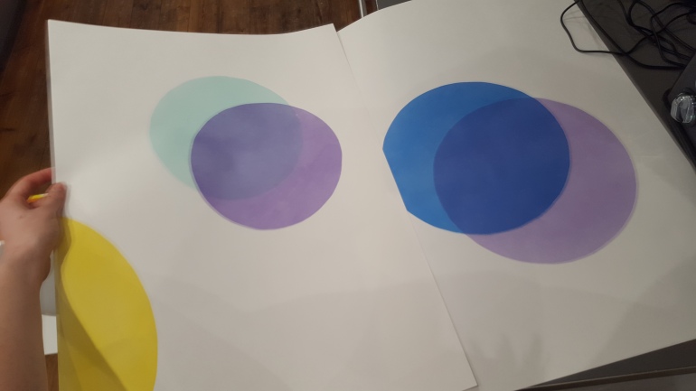
I left them for the time being and headed back home. However, i had also been thinking about the art of airbrushing. I knew this was another possibility as you can get a really precise effect. I could create even lightweight colors and tone and the overlapping of the colors would work well. I have acrylic inks and knew that the colors i had were the ones i had in mind for the posters. Therefor i decided to carry out some tests to see what effects i would get. Initially i didn’t like the first test i carried out. I had used the airbrush too heavily leaving really opaquer block colors and visible pencil lines. However i saw the potential and knew where i had gone wrong.
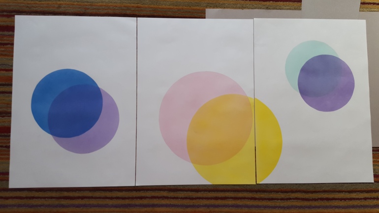
I went for it again, this time with more precision and the knowledge i took from some of the reductive mark making techniques we worked on during the mark-making workshops earlier in the year. I was more careful with my scalpel and use of masking tape to attempt the perfect circles. I held back much more with the airbrush knowing when to stop. As a result i got a much more refines circles and really delicate layers of color. The colors were a much more accurate reflection of the mood of each song. I learnt that simplicity and minimalism is something to be respected.


The final images worked well as a series and one color from each poster was mirrored in one of the others keeping them in theme.